OVERVIEW
This is a web app I designed for Tufts University Prison Initiative, specifically for the incarcerated students from Bunker Hill Community College. It allows students to check their current progress in completing a degree, as well as selecting classes for each semester.
My Role
User Research,
UX Design
Team
1 Product Manager
1 UX Designer
9 Developers
Client
Tufts University Prison Initiative (TUPIT)
Design Timeline
10 months, 2021–2022
BACKGROUND
Tufts Prison Initiative is looking for a web app to help students track their academic progress and select classes.
Extending the vision of Tufts University, TUPIT is dedicated to providing transformative educational experiences that foster incarcerated students to become active citizens of change in the world. The app will be similar to Tufts Student Information System to assist them as they work towards completing an Associates degree from Bunker Hill Community College and a Bachelor’s degree from Tufts University.
SOLUTION OVERVIEW
A student information system that integrates academic progress and class selection with clearer organization.
Students can now easily locate classes based on subject and status and create several class arrangement plans on the calendar to avoid a cramped calendar. The degree sheet is implemented in the same page, thus, students no longer need to open several tabs to check for necessary information.
USER RESEARCH
What are students’ pain points with the current design?
Luckily, as a student myself, I was able to find several users in the school since everyone has used the same system. I first utilized SideChat, an app that allows users to post anonymous threads. I wanted to find out what are everyone’s most frustrating aspects when they are planning and registering for classes. I received many comments, and even though some of them are quite informal, I was able to get a general grasp of the general pain points.
I discovered 4 general trends:
1: UI & browsing experience
It is difficult to navigate among all the class informations because the current layout does not surface important information. Overall, the design lacks information hierarchy.
2: Rigid process & usability issues
If users want to change the same class to a different time slot, they have to delete the class and add it again. If users want to keep the same class and change the lab session of that class, they need to delete the class and lab together, then select the ones they want.
3: Scattered information
Users need to open several tabs to plan their class schedule - calendar view, class information, and academic progress.
4: Technical issues
The system… sometimes will breakdown.
INTERVIEW & INSIGHTS
The anonymous feedback gave me a general sense, but I wanted to understand the pain points in more details. Moreover, regarding information hierarchy, I wanted to know what metadata students want to see when browsing classes.
I interviewed 8 students from all year groups. I inquired about their general experience and also asked them to walk me through their process in a step-to-step format while explaining what they liked and what they found to be difficult. I then gathered all the pain points I’ve found and organized them in a user journey map.
This map definitely gave me a more insightful perspective into specific pain points. Since the current system has three main page, I wondered how each page can be improved based on these pain points.
1: Class information page
inefficient display of information: no metadata is shown until users click on the expand button for each class.
there’s no information hierarchy in “details” of each class. All information is in one lost list with the same font size.
Almost half of the space of this page is not in use.
Need to open two separate windows to show calendar and class information.
2: Calendar view
one color for all classes in the calendar page.
all classes are organized in random order.
if users have several plans, the calendar view will be overpopulated of classes with conflicting times.
does not surface important information like location
need to delete the entire class to change the time slot
3: Enrollment cart
classes are organized in random order.
selected classes are scattered among the list.
need to go through three processes to successfully enroll all the classes.
CASE STUDY
I also interviewed 3 students from other schools and let them take me through the process. One school’s design caught my attention.
Carnegie Mellon University’s student information system design is not perfect, but there are some great aspects!
What stood out to me:
students can create several plans to organize their different class arrangements.
every class is color coded.
students can direct switch sessions on the calendar page instead of deleting then adding the same class.
IDEATION
Based on the insights I’ve found for each page, I drafted design solutions to target these pain points one-by-one.
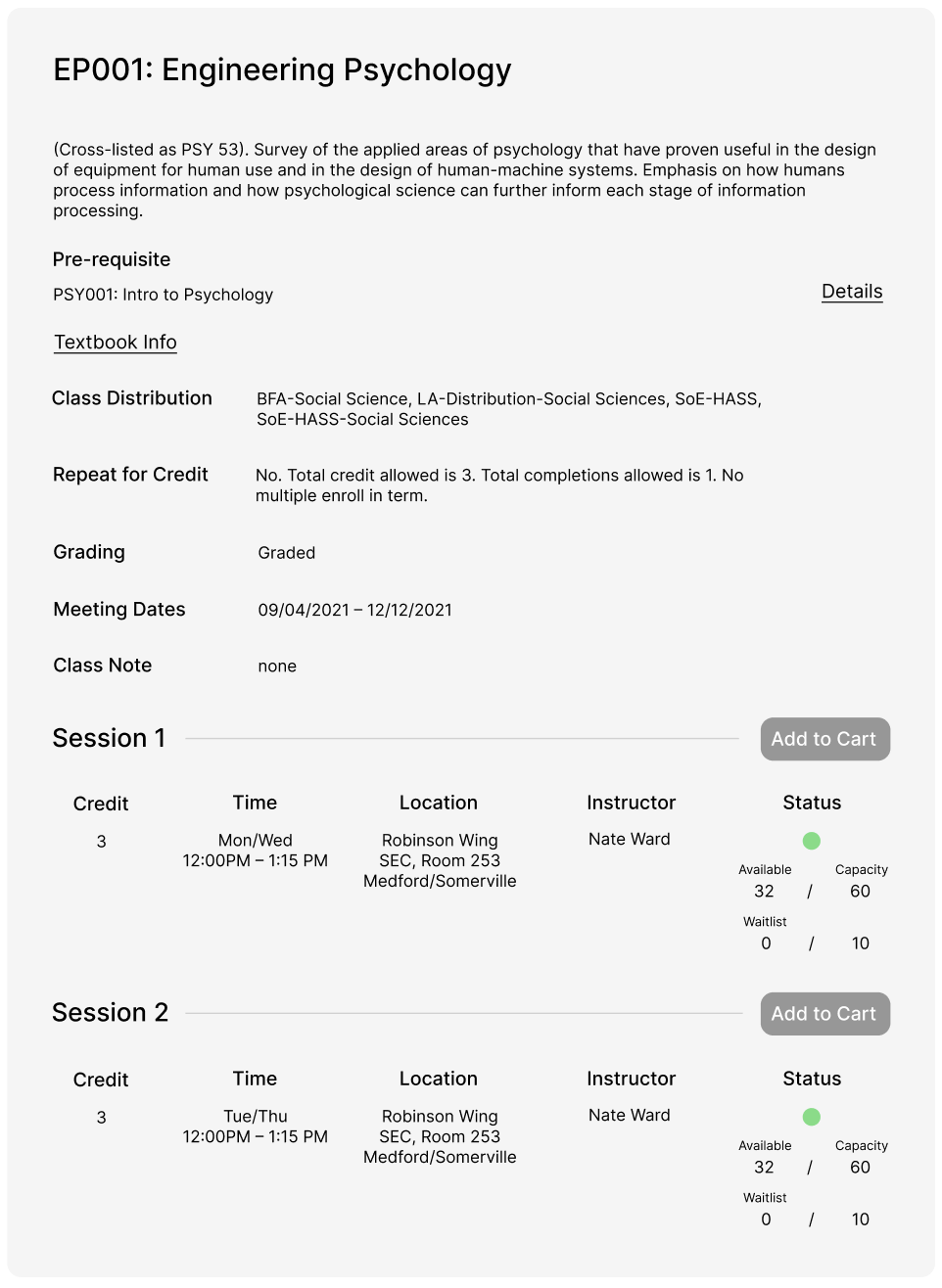
1: Class information page: Lack of information hierarchy
Based from my interviews, students pay the most attention to the class status (available, waitlist, full), time slot, how many credits, the professor, and pre-requisites. However, the current design does not surface the necessary information. Specifically, the lack of visual alignment and monotonous text give students a difficult time navigating to find the important information.
Solution:
I changed the layout of class information by pushing the important metadata to the top, then class section information. For example, “Pre-requisite” has its own section instead of being included in the description paragraph. This provides more visual clarity. How many spots available is shown directly in the page – students no longer need to open the “details” panel and search for that information.
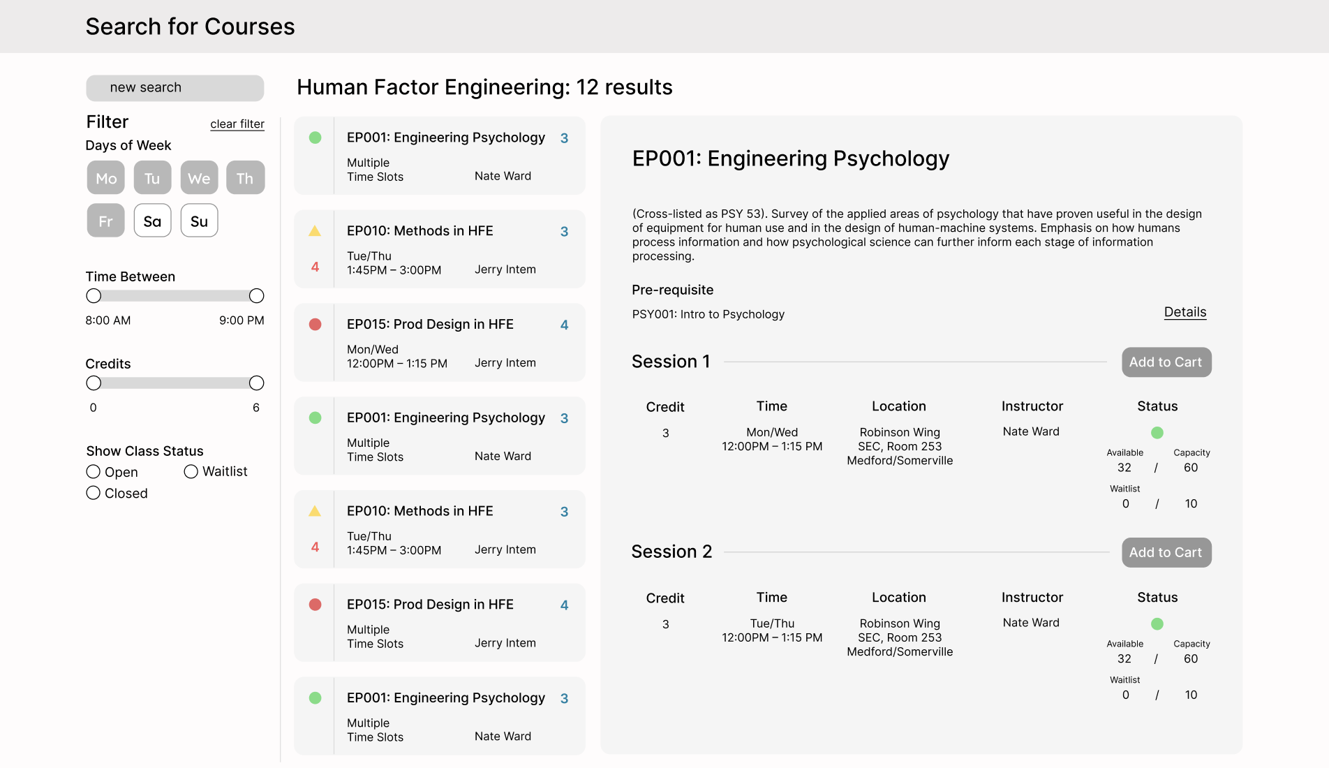
2: Class information page: inefficient display of information
The overall layout does not display necessary information upfront. Students need to click open the accordion to view specific information. The class list only displays the class number and the class name. Students cannot get an overview of all the informations but need to click through each one of them.
Solution:
I recalled the different layouts in email. Since each class name is not long, there are ample blank space on the page that’s not in use. Thus, the blank space can be used for direct display of class information, so users no longer need to open and close the accordion every time. Moreover, based on the research findings about what metadata is important to students, I designed the class list items to specifically include these information. For example, class status (full, waitlist, available) is important, so I placed the status display at the very left of the list item for better isolation and clarity.
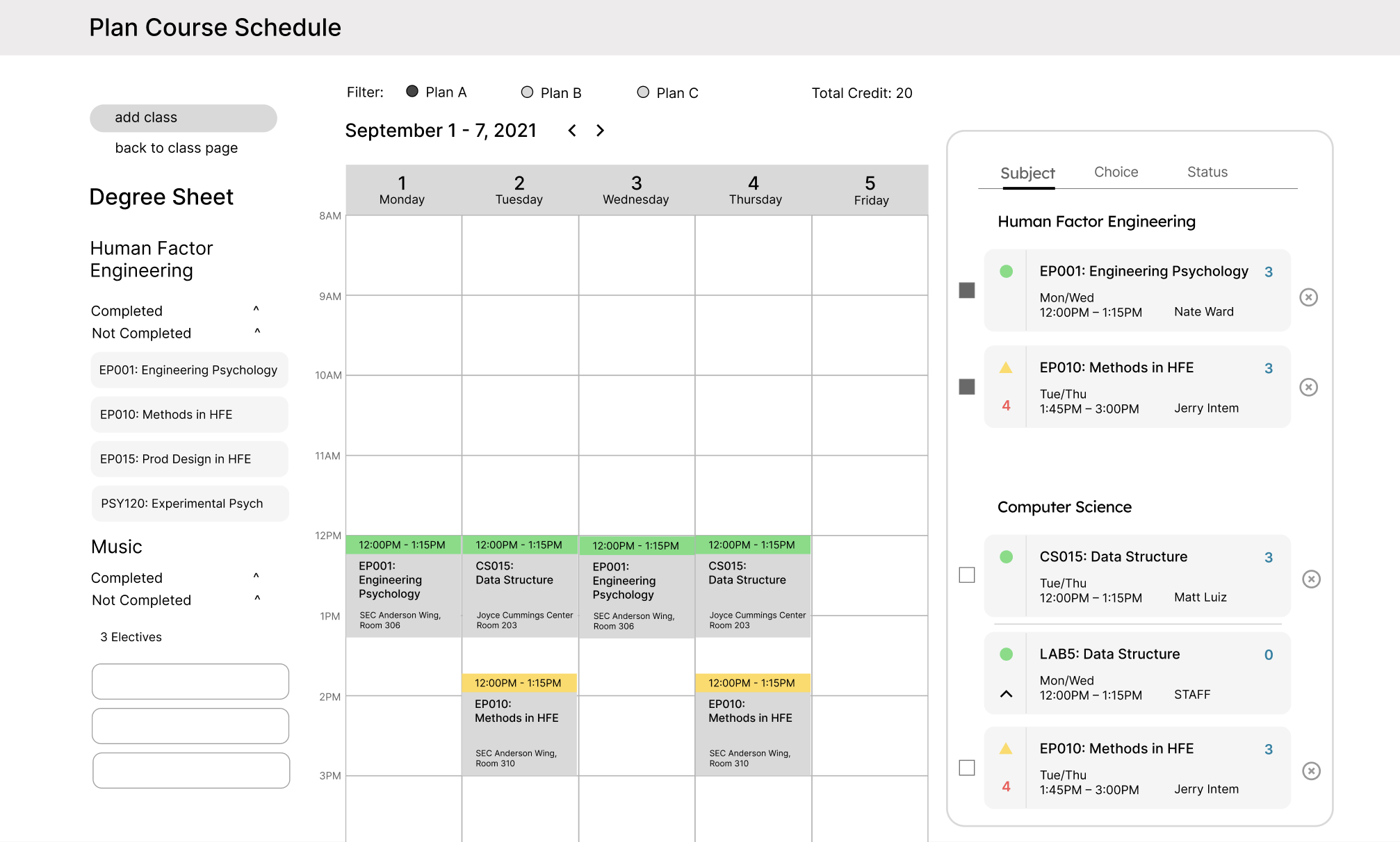
3: Calendar page: colorless blocks & orderless list
The list of classes here has no rules of order, which is difficult to navigate when students selected a wide range of classes. All the class blocks in the calendar also are shown in the same color, which can cause confusion.
Solution:
I categorized all the classes based on subjects, choice, and status. Students can manually arrange their classes based on their preference. For classes, I planned that classes in the same subject area will have similar hues. Moreover, I placed the degree sheet next to the calendar, so students can select classes based on the requirements.
4: Calendar page: conflict of classes
If students have different class plans or more than one major, they need to add multiple classes to figure out the best schedule. Schedule conflict occurs when they only have one calendar page to plan.
Solution:
In the new design, I added filters to the calendar and allowed students to make different plans on the same calendar. This will avoid overly-crowded calendar interface when students make all the plans in the same page.
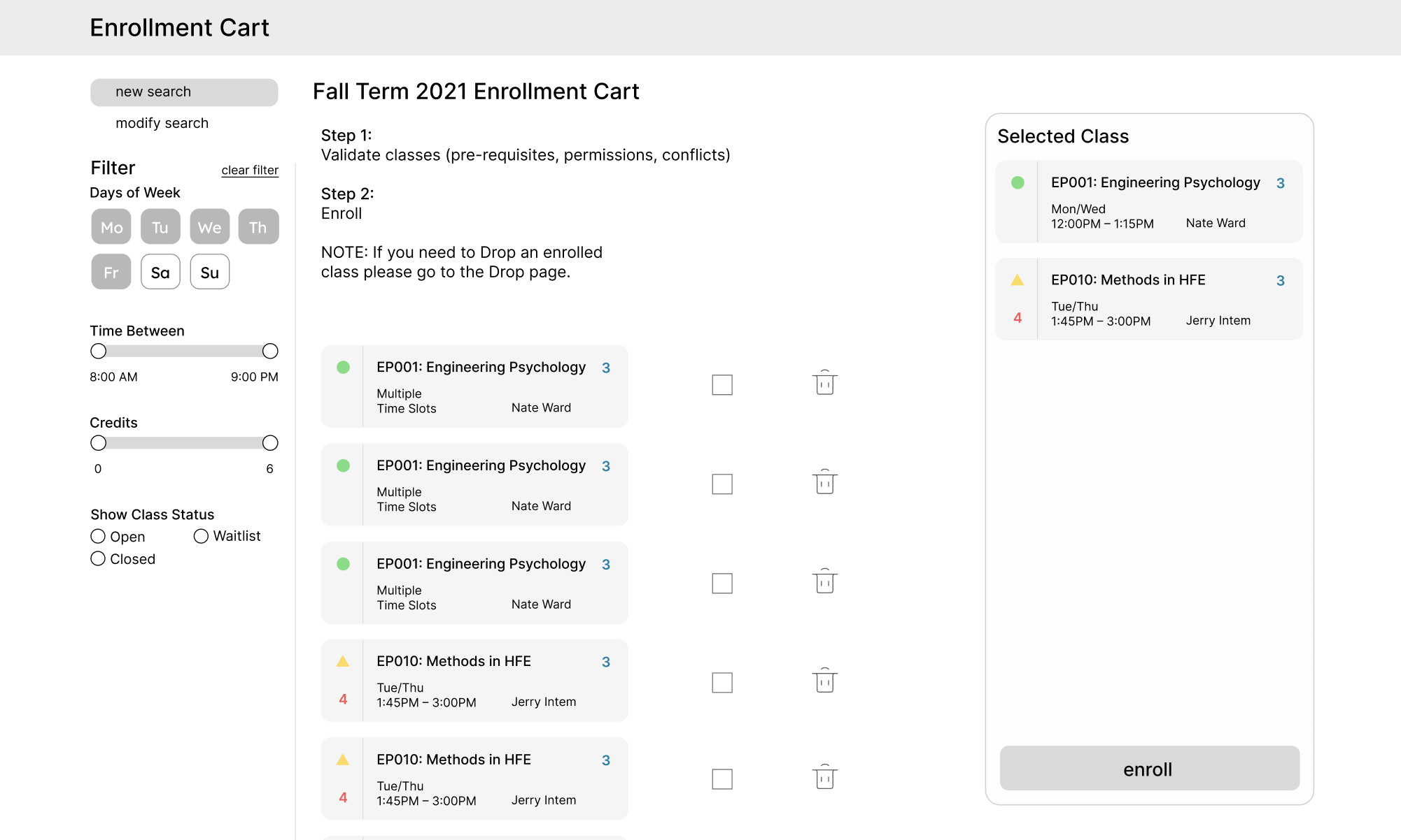
5: Enrollment cart: lack of order
There’s no alphabetical order or order based on academic subject, status, or professor etc. Students need to look through the list to select the class they want to register. Once students selected the classes, these classes are still scattered among the list.
In the new design, I ordered the list based on status, since whether a class is available or not is the most important information that students are looking for. Moreover, I added a section called “selected class”, so students can see what classes are selected in one glance.
Solution:
USABILITY TESTING
With the new design, I conducted 8 usability testing to find out how much it alleviates students’ pain points – and what problems are still there?
I did try to solve most of the problems, which caused drastic changes to the whole experience. I need to make sure that these changes will eventually benefit the users. For the test, I asked them to look at the information layout of the class information page and complete tasks such as “find how many people are currently enrolled” etc.
The results are generally positive, but I realized areas I can improve on:
Number of plans is fixed in calendar
Students reported that having the control over how many plans they can create will be more beneficial than just having a fixed number of 3.
Still need to open a separate tab to view class information and calendar
Having degree sheet implemented next to the calendar view is helpful, but students still need to open a separate tab to view class information and calendar together.
Appreciate enrollment cart organization, but wants more customization
Students appreciate that the enrollment cart is organized by class status; however, they wanted to see the list organized in their different plan types too.
Would like more flexibility in changing time slots
Student like the organization of the class list, but they still wish that they can change labs right in the calendar view.
DESIGN CHANGES
Based on the feedback, I made changes to the wireframes and improved on the level of flexibility and customization.
1:
Before: only three plans
I only included filters for 3 plans, but I did not realize that some students want to create more than 3 plans.
Now: “manage plan” button
To accommodate more habits and convenience, I included a manage plans button to allow them to freely customize their plans.
2:
Before: still need to open two separate tab for calendar and class information
I changed the layout to make sure all the information is displayed in an efficient and well structured manner, but I did not consider the overall navigation.
After: calendar toggle
The main reason to check calendar view is to see whether there are conflicts. This is unachievable by looking at the class information page solely. Thus, I included a calendar toggle in the class information page to help students both view class information and time conflicts.
3:
Before: unable to change time slots in the calendar page
I focused on organizing class list and adding plans to make the navigation and process easier, but I neglected the UX problem of unable to change time slot in calendar page.
After: drop down view of all time slots
With the new design, there’s a “click down” button in classes with multiple time slots. Students can simply change the time slot by clicking on another one.
4:
Before: unable to view classes based on plans
Even though I organized the classes based on status, which is the most important metadata students seek for when they select classes for enrollment, students also suggested that they want to see the list organized based on their plans.
After: can view classes based on plans
The new design included a filter of plans to help students navigate among the classes better.
High Fidelity Prototype
Here’s the final design of the student information system after 3 iterations:
Better organization
Courses will be organized based on "Subjects", "Status" and "Choice", which is much easier for navigation.
The user now can easily locate classes based on subject and status, and use "choice" to organize their first, second, and third choices.
Degree sheet is attached on the left for reference.
No more busy calendar
An "add plan" function allows the user to create several plans for course selection. Instead of cramming all class choices and plans on one calendar and having a difficult time, the user will have a clear navigation of all plans.
Information hierarchy + calendar toggle
The list of courses will include the key information upfront about each class. Class details will shown up on the right side with a better organized structure.
To avoid time conflict when choosing a time slot, the user can toggle between calendar and course list to decide.
More visual cues + organization
In the enrollment cart, all course will be organized according to their status. There will only be one process of both "validate" and "enroll" to make the process less complicated.


