OVERVIEW
SiriusXM was planning to relaunch products in all platforms in December 2023. To make SiriusXM’s product portfolio more comprehensive, I designed the entire Apple Watch app and led the end-to-end process with the consultation from other designers and product managers.
My Role
UX Design
Team
1 Product Manager
1 UX Researcher
1 UX Designer
2 Content Designers
2 Mentors
Design Timeline
4 months, Summer 2023
BACKGROUND
SiriusXM currently offers a range of products including apps on mobile, web, TV, and CarPlay platforms to provide users with a diverse listening experience. I joined SiriusXM in May 2023 as a product design intern. During that time,
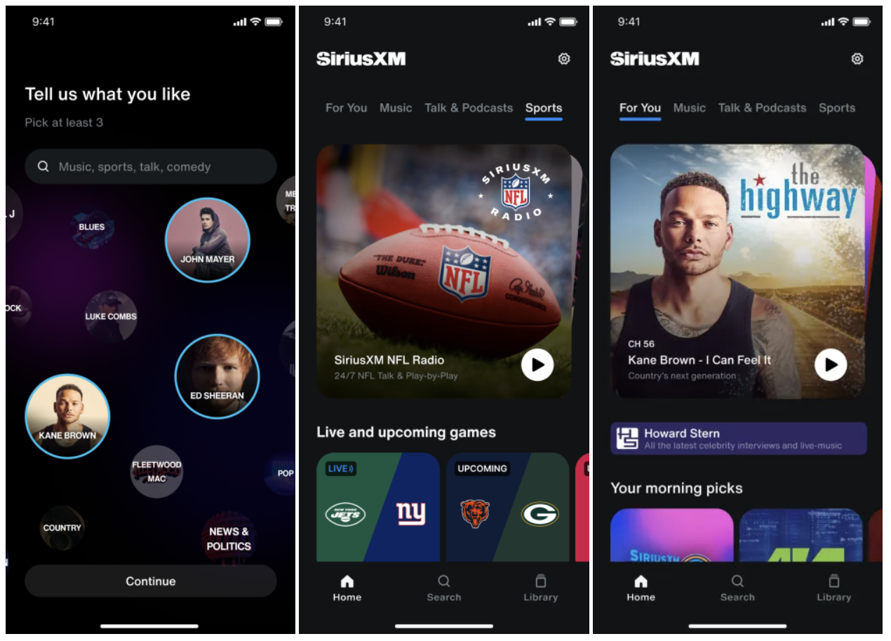
the team is re-designing all the platforms. SiriusXM relaunched all of their products during December 2023.
SiriusXM new mobile app design
PROBLEM
Most apps were already designed in MVP, except wearables.
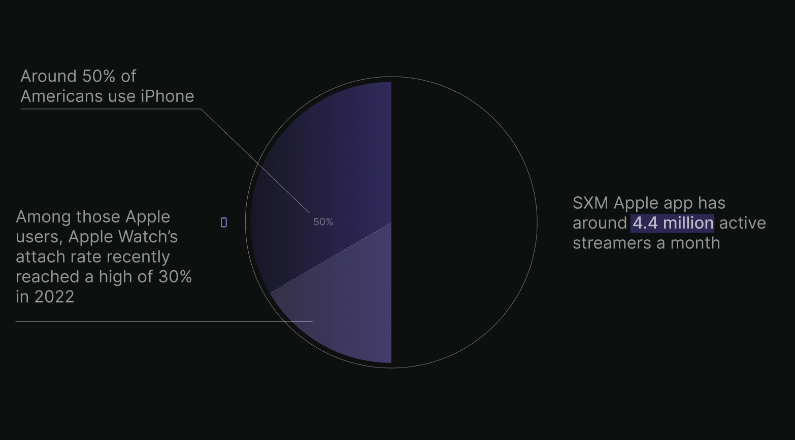
The wearables industry is a growing market. With over 30% of Americans using the Apple Watch as a companion device to their mobile phones, the untapped potential of this platform presents a missed opportunity for engaging a broader audience and providing a seamless on-the-go listening experience.
My goal is to develop a user friendly application for the Apple Watch that offers on-the-go listening experience, complementing SiriusXM’s existing platforms and expanding their reach among tech-savvy audiences.
SOLUTION OVERVIEW
On-the-go listening experience
The app offers a portable solution for users to enjoy audio content while traveling or moving around. It enhances convenience and accessibility by catering to the needs of individuals who prefer to listen to music, podcasts, or other audio materials outside their homes or workplaces.
MARKET RESEARCH
Almost 1/3 of Apple users are also using the Apple Watch as a companion device.
This is a huge opportunity in the market for SiriusXM to develop an Apple Watch application to engage with more users and provide a more convenient platform for Apple Watch users.
Competitive Analysis
There are two popular app structures for listening experience on Apple Watch: branched view & paginated view.
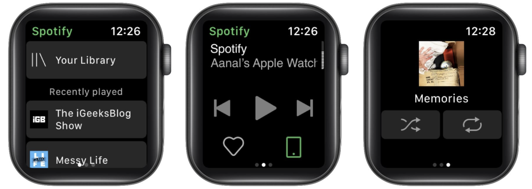
I have zero experience in designing apple watch apps… Luckily, I was able to receive an Apple Watch from SiriusXM to explore its design. After reading through the Apple Watch documentations, I looked at the Apple Watch app of iHeartRadio, Apple Music, TuneIn Radio, Spotify, Pandora, and realized the two main patterns. To determine which structure fits better with SiriusXM, I did a competitive analysis between Apple Music and Spotify, representing the two structures.
1: Overall Structure
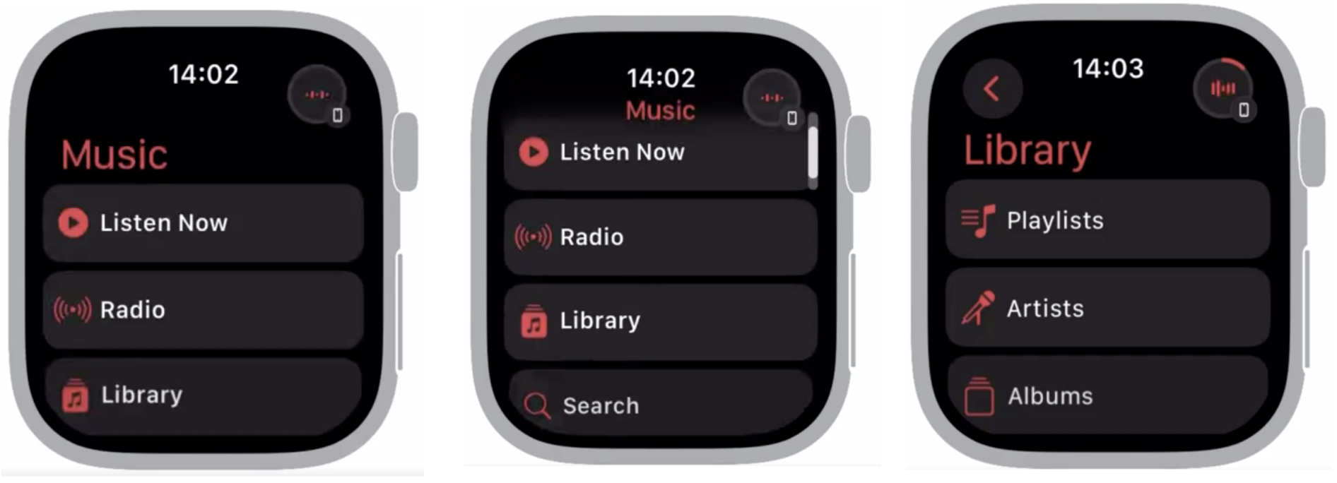
Apple Music: Branched Structure
Home screen is the landing screen.
Users click into each category to find the content they want to listen to
Focus on browsing & content selection experience
Spotify: Paginated Structure
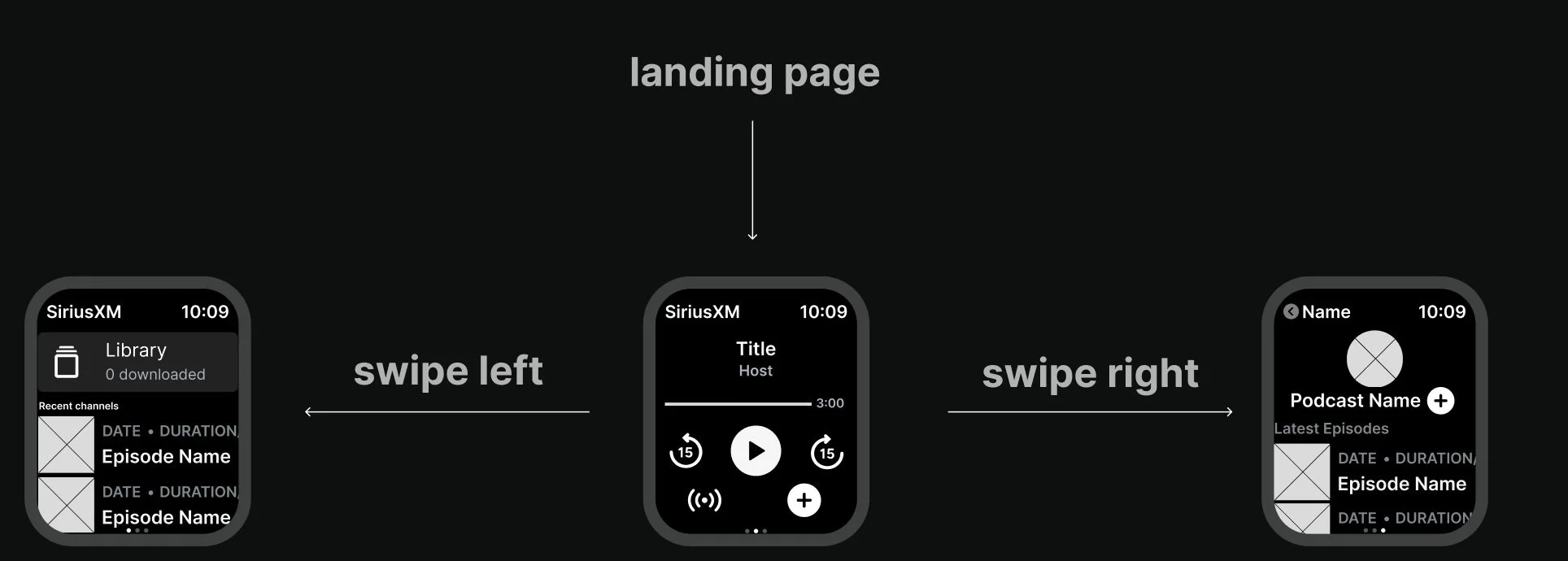
Player screen is the landing screen
Swipe left to browse home screen (library); swipe right to browse individual episodes / playlist.
Focus on player experience
2: Home Screen Layout
Apple Music: Branch View
Content is organized in menus
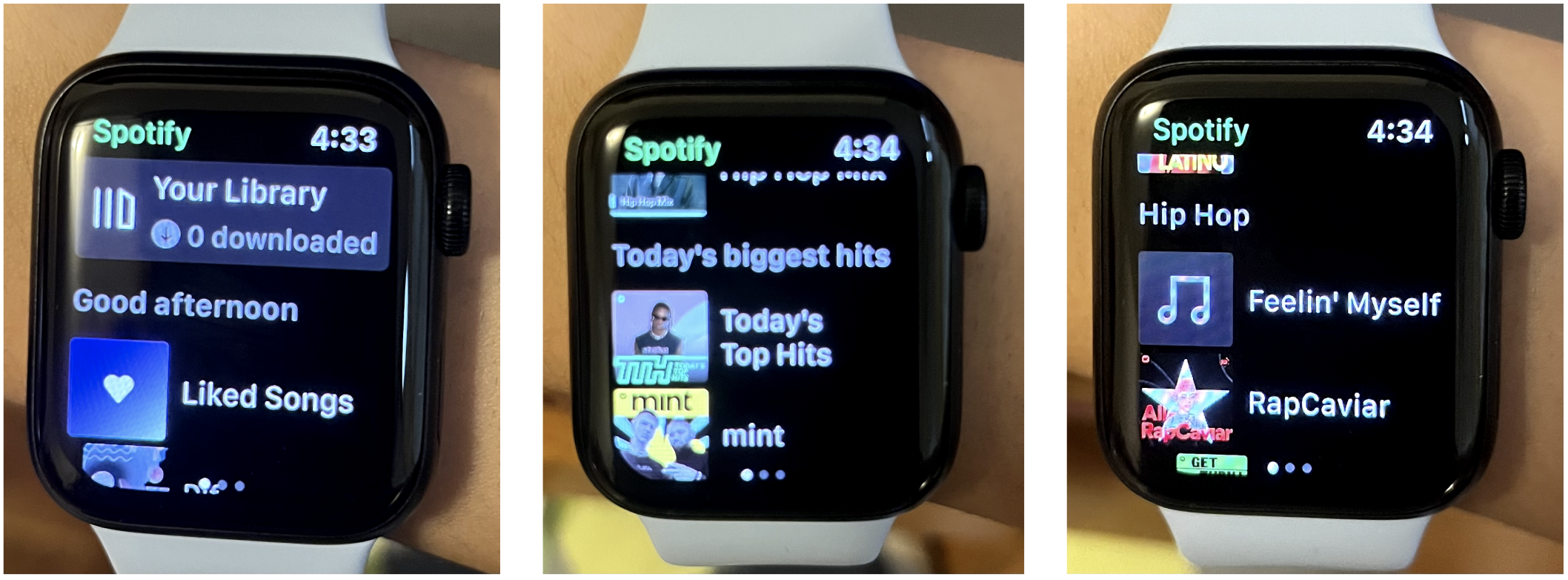
Spotify: Display View
Content is directly displayed in the home screen
USER RESEARCH
So… what overall structure aligns more closely with SiriusXM users’ needs?
I teamed up with a UX researcher to tackle this problem. We wanted to understand their current habits of using the SiriusXM mobile app and Apple Watch in general.
Along with past data and research results they have gathered, I summarized the insights that helped me to determine the most suitable overall structure:
1: Loyal to saved content
Most users are loyal to their saved content. They do not spend much time browsing for new content.
2: Listen to one episode in several settings
Since some audio contents are long, users tend to finish these contents in several settings. Thus, they want to continue listening to where they left off.
3: Small screen, quick actions
Most users don’t spend much time on Apple Watch. They like to perform quick actions such as checking time, “stop/play” audio content. They perform longer actions on their phones.
OVERALL STRUCTURE
Since users are loyal to saved content and want to continue listening to where they left off, the paginated view will be more suitable.
SiriusXM Apple Watch app should be aimed to create an on-the-go listening experience, thus users need to be able to play their desired content in as little clicks as possible.
With the size constraint of Apple Watch screen and users’ habit of listening to saved content, users are less likely to browse on their watches. Thus, the app itself needs to limit the browsing experience and focus on player experience. The player screen should be the primary page that users can have access to at any time of their experience.
CONCEPT TESTING
I created two home screen prototypes for the test to see which one fits with user needs.
Home screen organization is also crucial to determine the app’s function as a companion app. Since the home screen’s functionality is content finding, I need to figure out how to make sure users can find their content in a timely way and how to organize the content.
Branch View:
Content organized in menus
Feedback for branch view:
Clear and direct layout of the menu
Logical, if users know the exact content they are trying to find, it only requires a few clicks without much browsing
However:
Nested structure: users need to click the “back button” a few times to go back to the home menu.
Users tend not to browse on the watch, especially on the “recommended” section
Users reported that they prefer seeing the actual content “faster”
Display View:
Content is directly displayed in the home screen
Feedback for display view:
Can reach to the desired content in as little clicks as possible.
Less nested structure to cause confusions and more clicks.
However:
If the target content is all the way at the bottom, users need to scroll while looking for the content.
If users know exactly what section to go to, they couldn’t just click on the menu item but need to scroll to it.
Decision: display view
With feedback from the product design team, I made the decision that display view should be the home screen layout. Based on previous research that users are loyal to their saved content or want to continue listening to where they left off, I need to make sure they can go back to their content in as little clicks as possible. Thus, the display view stood out since users don’t need to browse through menus to find their content.
INFORMATION ARCHITECTURE
After main structures are determined, I faced a big challenge: for a companion app with limited functionalities, what home screen content types should be included to suit users’ needs?
The watch app should not include all the content and categories from the mobile app since it is a companion app. But it also should include enough content to give users flexibility. I gathered all the menu titles from mobile app and ranked their importance to the watch companion app. Here are the questions:
what’s the order of the whole menu list? What should menu item should be eliminated?
should library be placed at the top or “jump back in” placed at the top?
should we allow users to pin their favorite channels to the home screen or should we display users’ liked channels directly in home screen?
how many recommendations should be included in “recommendation / just for you”?
Home screen first iteration:
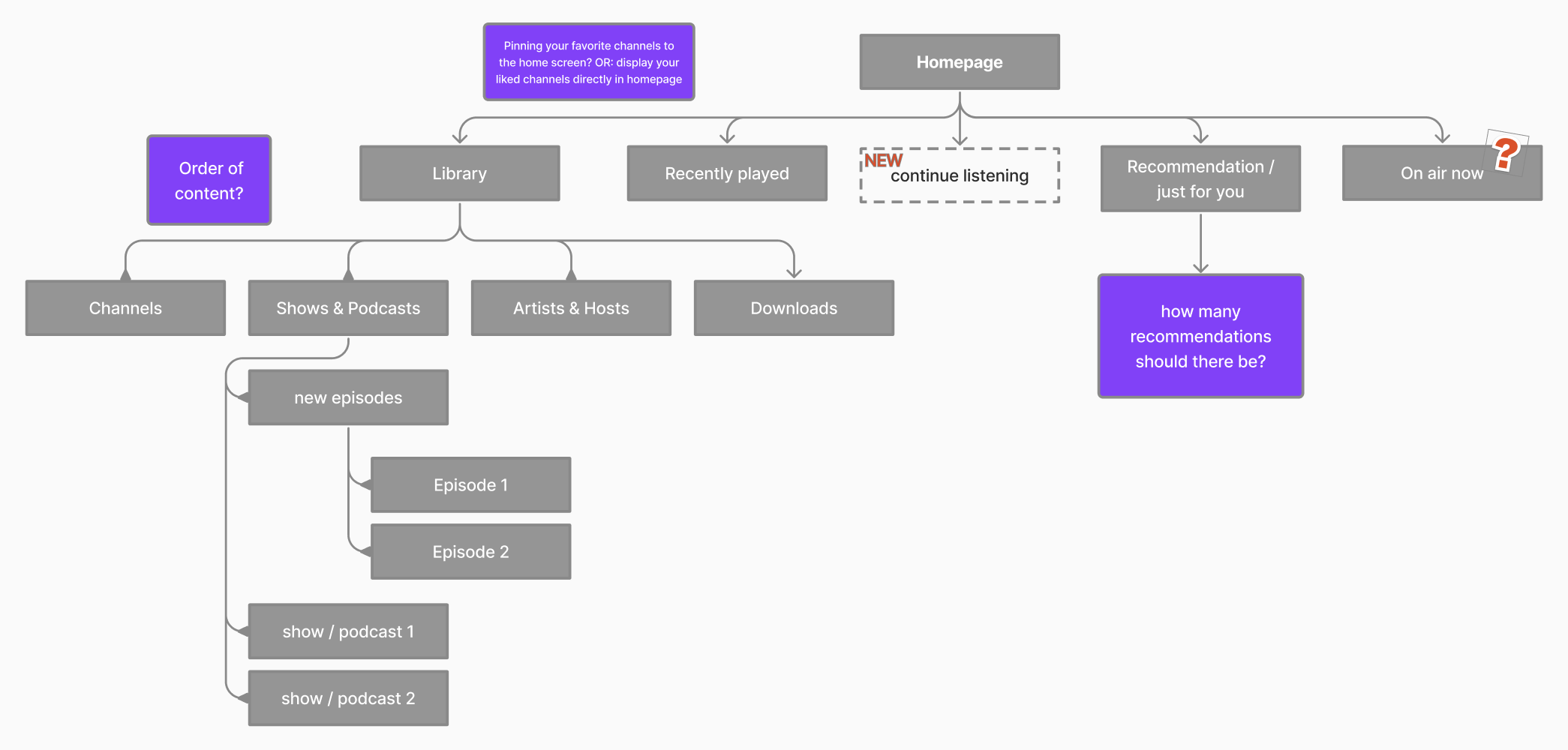
There are lots of uncertainties regarding the order of lists and what to include in the lists. If we want to include everything from the mobile app, the watch will be overloaded with unnecessary content and functionalities. However, the bigger question is: what to keep and what to cut? After talking to the content designers, I added new items such as “continue listening”.
Home screen final iteration:
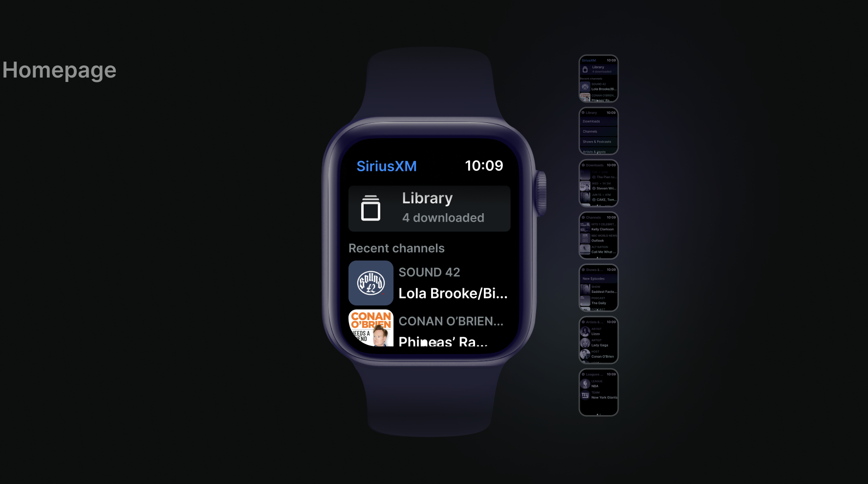
The menu list is largely based on users’ saved and unfinished content. We ranked the likelihood of users clicking on specific menu lists, and placed the highest ranked item on top. Continue listening is also easily accessible on the player screen, thus, we placed it at second. “For you” is a recommendation section just in case if users are exploring something new.
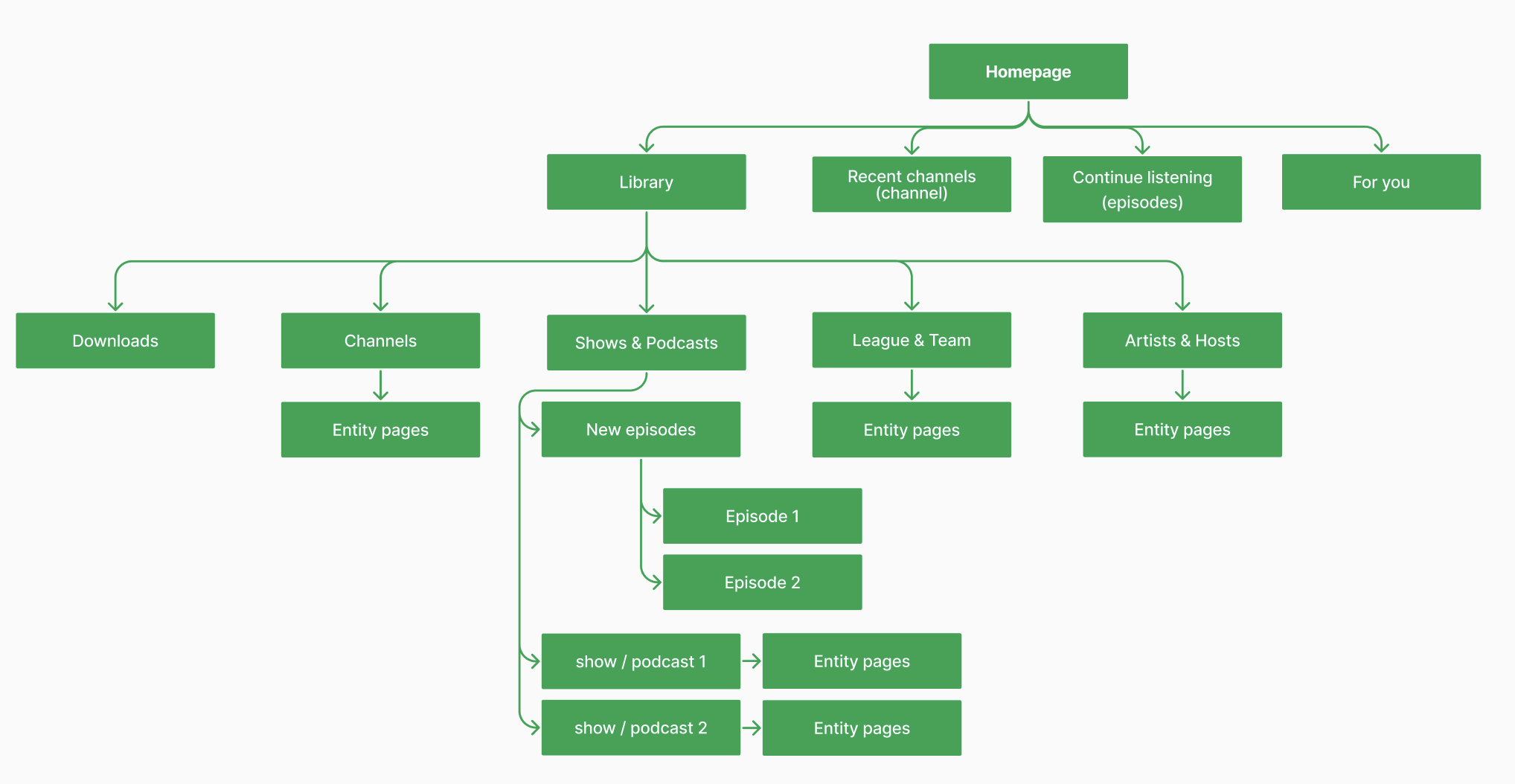
Overall information architecture:
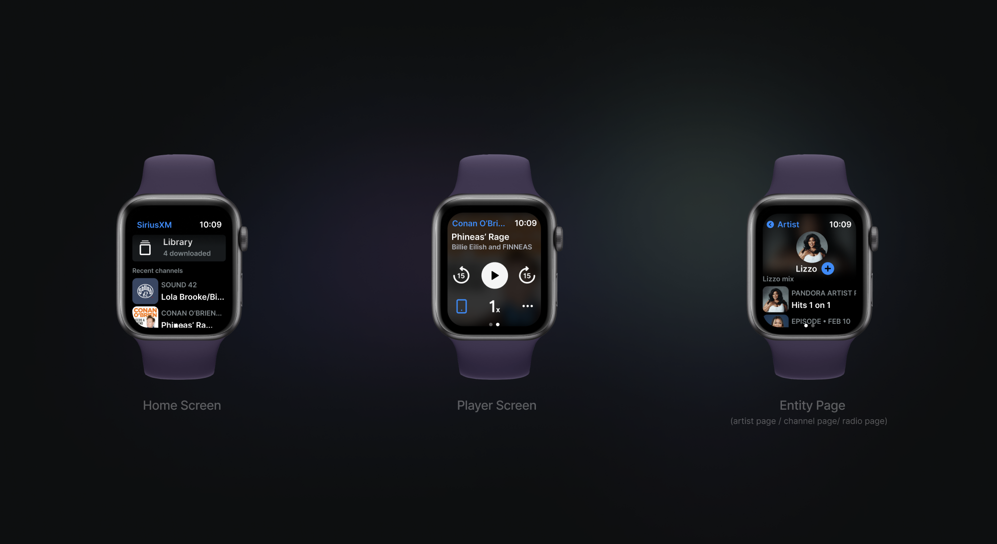
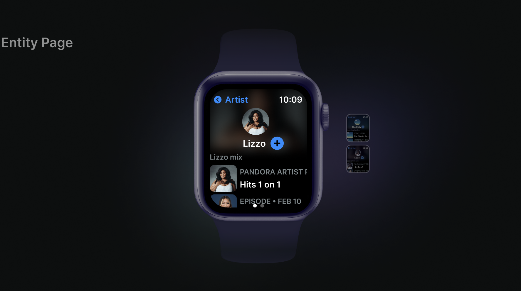
I constructed the overall structure. Because SiriusXM offers a wide range of content, the player screen for each content will be different. Moreover, the third page entity page will only appear when users are playing episodes.
PLAYER SCREEN VARIATIONS
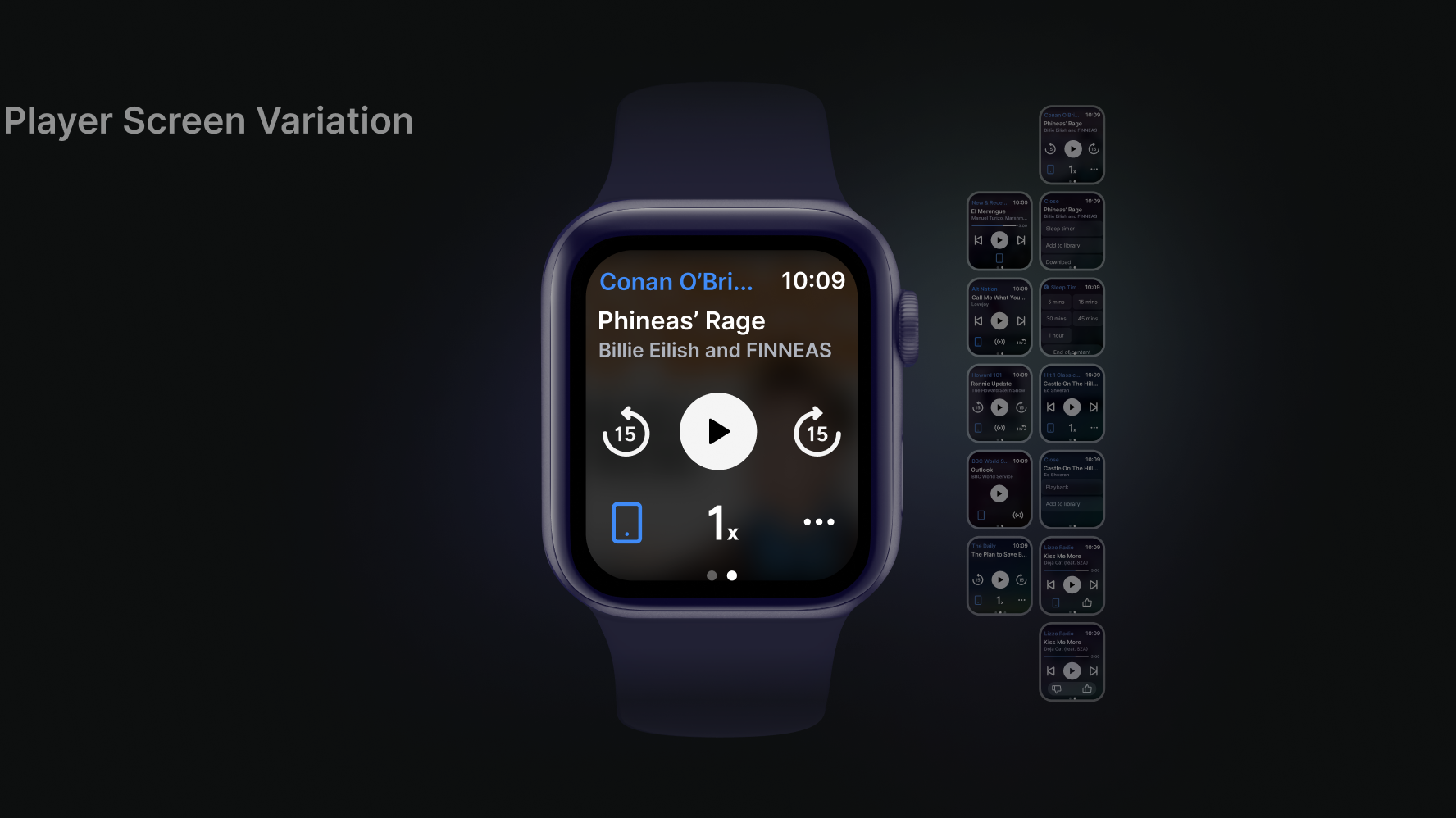
Due to the diverse content SiriusXM offers, the player screens are all different. I needed to design a layout that is suitable for all variations.
For some player screens, the play buttons and functionalities are limited (eg. the content type in the last mobile screen); for others, there will be more player related buttons as well as more functionalities like “sleep timer”.
I collaborated with the mobile app player experience designer to determine what should the watch interface look like. I proposed 3 different ways of organizing the player screen based on each content.
Version 1: for player screens that contain more than 6 buttons, only include the 6 most important buttons in the screen and make all player screens one-page-fit.
Version 2: include a “…” button to include the rest of the functionalities. Place “device” button in the additional page.
Version 3: include a “…” button to include the rest of the functionalities. Place “device” button in the main page.
After discussion with the team considering importance of functionalities and space, version 3 is the most suitable format because it keeps all the core functionalities and gives users access to additional functions.
HIGH FIDELITY SCREENS
The first version of SiriusXM Apple Watch app is born 🎉
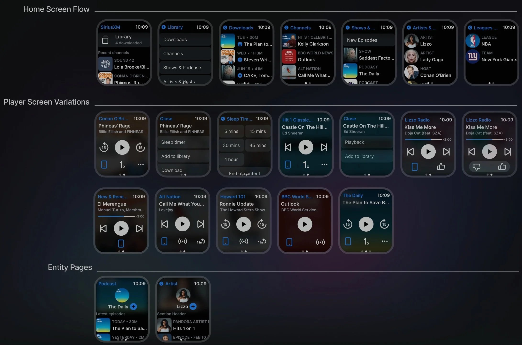
After defining the general structure of flows and specific page layout, I constructed high fidelity screens and translated existing audio content onto the watch screen. After populating the screens with high fidelity lists and buttons, I found the design to be a bit rigid. I then played around with fades, blurs, and opacity. For example, the home screen header has a subtle fade. When users are scrolling, the content will disappear more naturally instead of just being cut off by the border. For player screen, I decided that the background should be the blurred version of the front cover. This helps users to visually identify the content and also adds visual variety to the app.
PROTOTYPE
Home screen flow:
All the content is organized in display view. Users can directly interact with the content without many clicks.
The library is organized in menus because of the variety of content types.
Entity page flow:
The third page will appear when users are listening to episodes. Users then can swipe to the third page to check out other episodes in the same podcast.
Player screen flow:
Depending on what content users’ are playing, the player screen varies and contains different functionalities, for example, sleep timer for channels.
DESIGN SYSTEM & CONTENT GUIDE
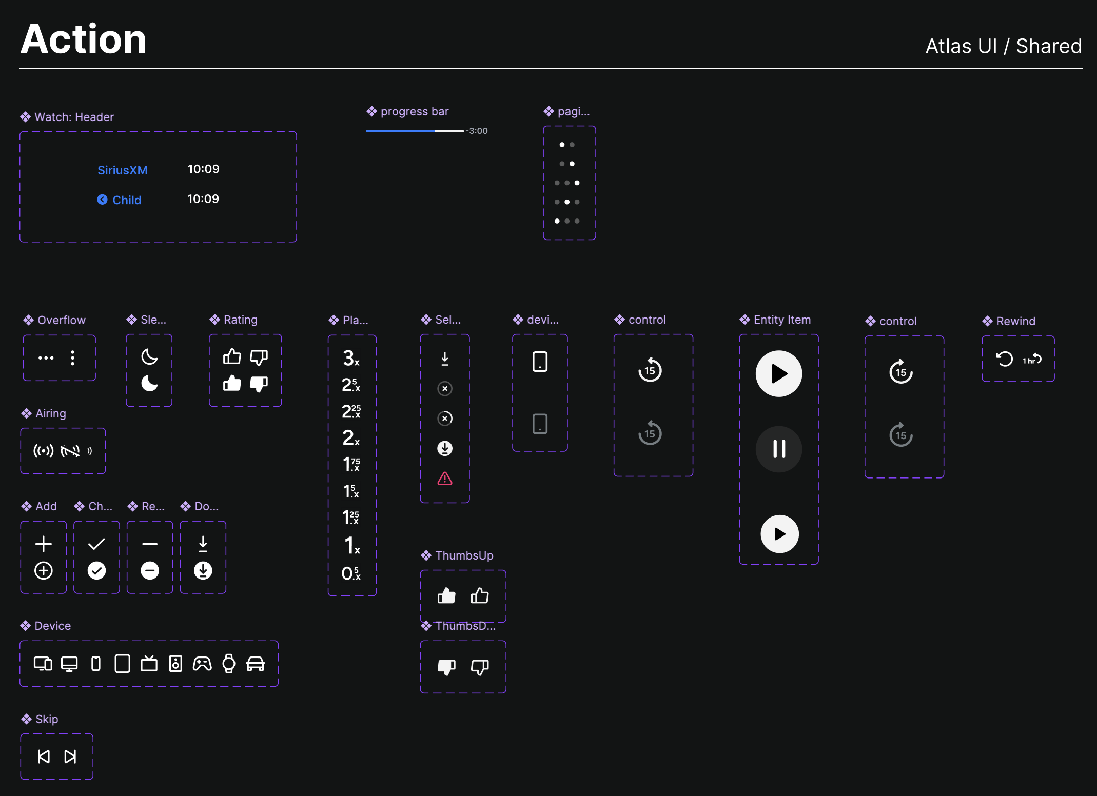
I started an Apple Watch design system for future watch designers at SiriusXM.
Unfortunately, my internship is coming to an end. If there are future designers continuing on my work, I want them to understand how every decision is made. I started the design system at the very start of the project. I defined the buttons for Apple Watch in terms of their size and type. I also made variations of list items depending on different content.
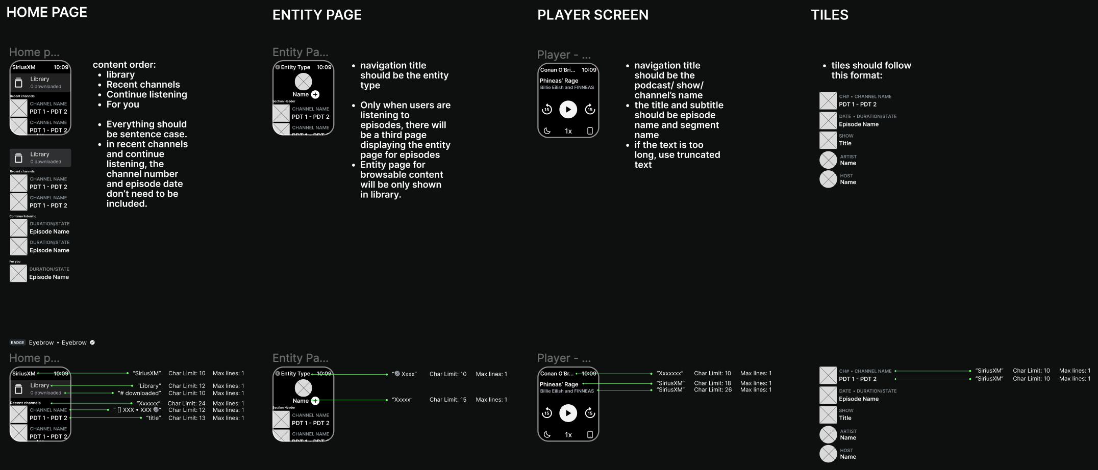
I also collaborated with the content designers and set up content rules for different screens and word count for sections.
TAKEAWAYS
Capitalize on the untapped potential of the Apple Watch platform, creating a valuable and convenient extension of SiriusXM's audio content offerings for users on the move.
By tapping into the growing popularity of the Apple Watch as a companion device to mobile phones, the project aims to expand SiriusXM's reach among tech-savvy audiences and engage a broader user base.
With the launch of this Apple Watch product in the future, it will make SXM platform more well rounded.
Documentation is key!
I had zero experience in watch app design. I did not own an Apple Watch before this project. I was a bit worried. Even though the screen is small and the functionalities are limited, I did not familiarity with it at all. Reading through existing documentations and look at different app designs helped me tremendously.
I also documented my steps along the way. This will help future designers understanding my decisions and getting onboard in an efficient way.
After all, it all comes down to users.
The biggest challenge I faced is selecting and organizing content in the home screen. It was difficult to know how many is the right number. What if there are too many redundant content? What if users complain that they could not find what they want?
I refined the information architecture multiple times to determine the general structure and the home screen structure. One of my mentors even called the whole watch app project an “information architecture" exercise. But eventually all the decisions are based from user research.

